The founder who checks every morning
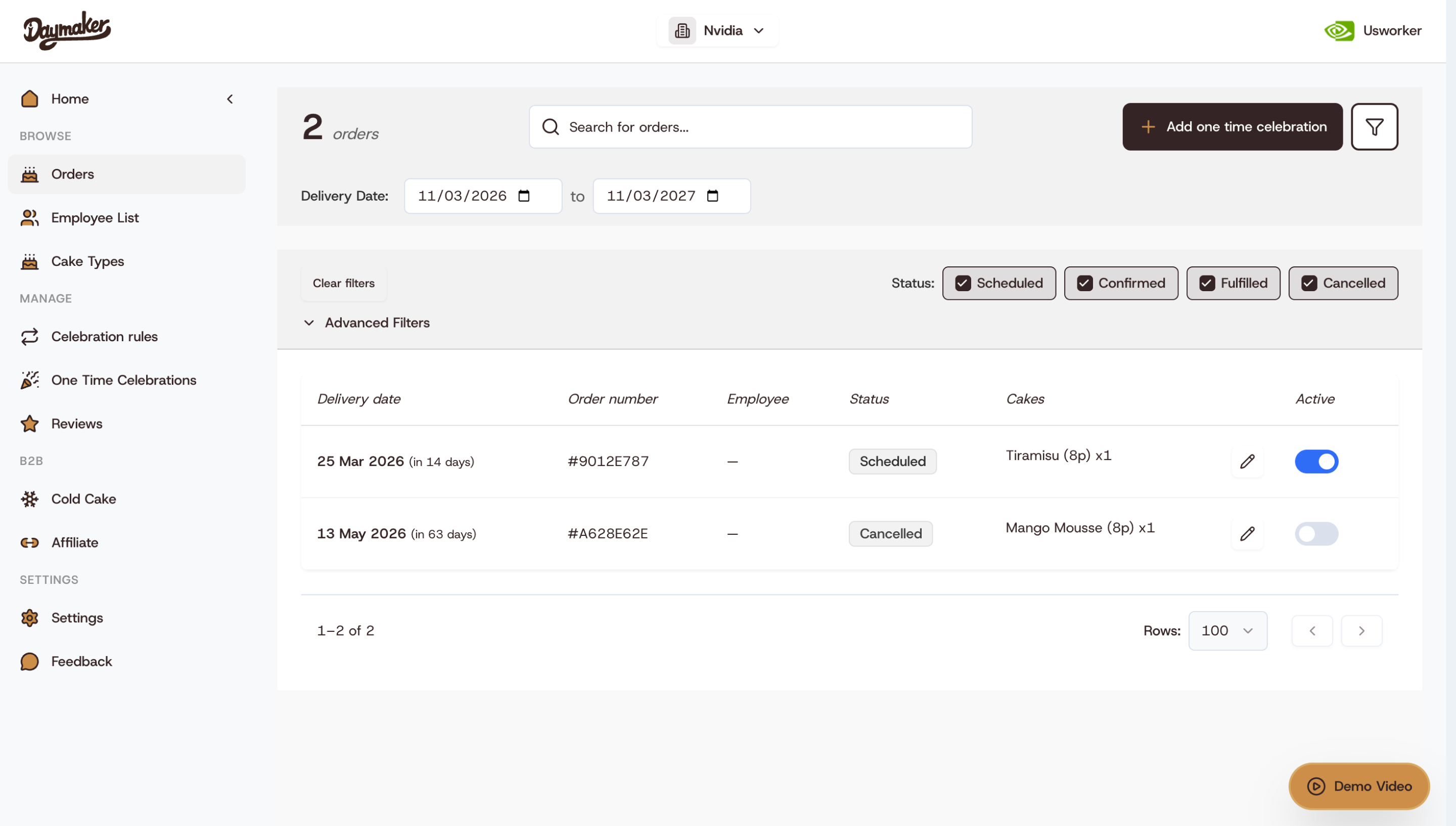
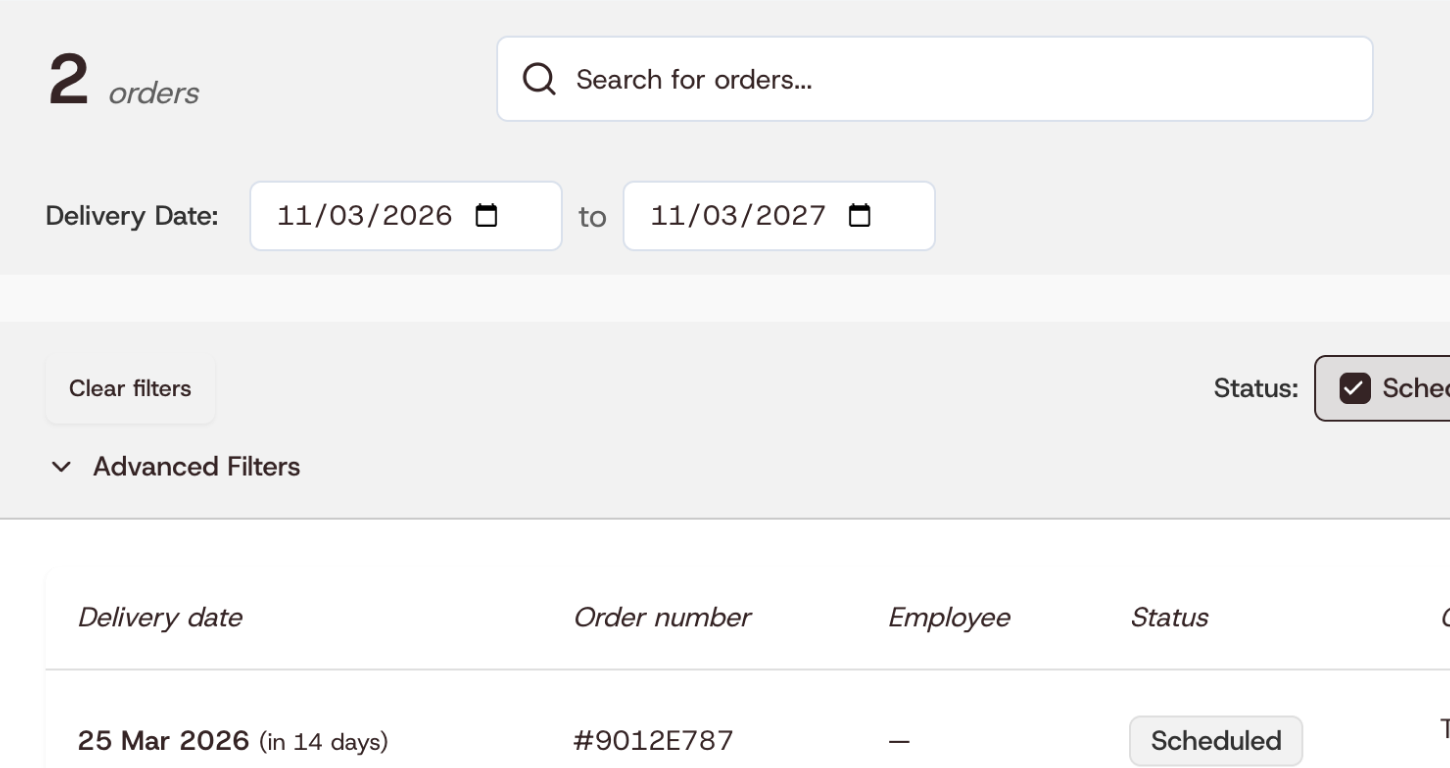
She read around grey tags and an empty Employee column to find the orders due that week. She needed to see who each cake is for, and which orders are live, without opening anything.

Case study · Daymaker · 2026
Daymaker sends cakes to teams, but its orders page had grown scattered, and founders had to hunt for each order. In two weeks I audited the page and merged its scattered parts into one table you can scan. The redesign went to the founders as Figma screens and a working prototype, ready to build.

Drag the handle to compare the Lovable version with the redesign.
Quick look
Two weeks to turn a scattered page into one table a founder can scan.

She read around grey tags and an empty Employee column to find the orders due that week. She needed to see who each cake is for, and which orders are live, without opening anything.
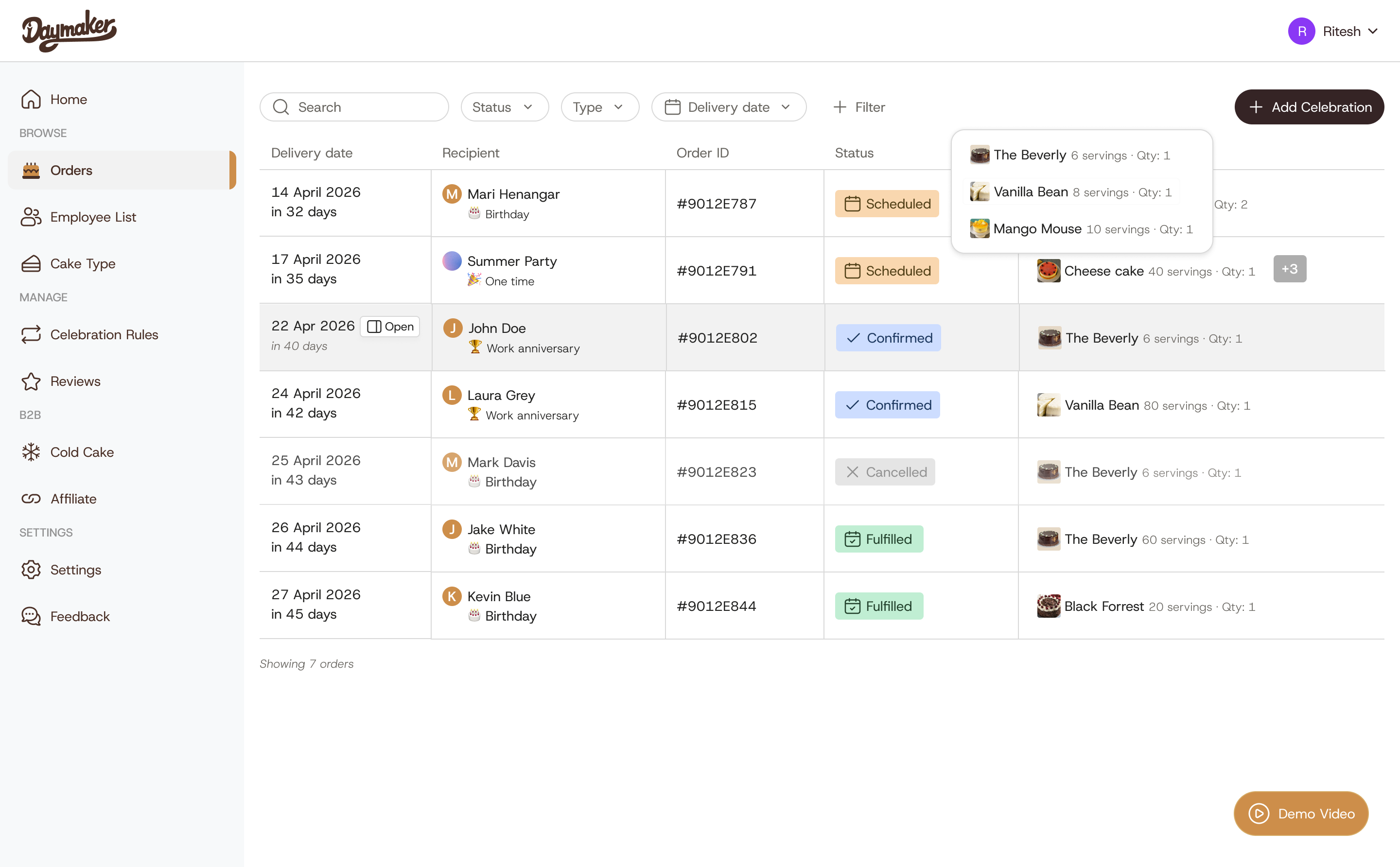
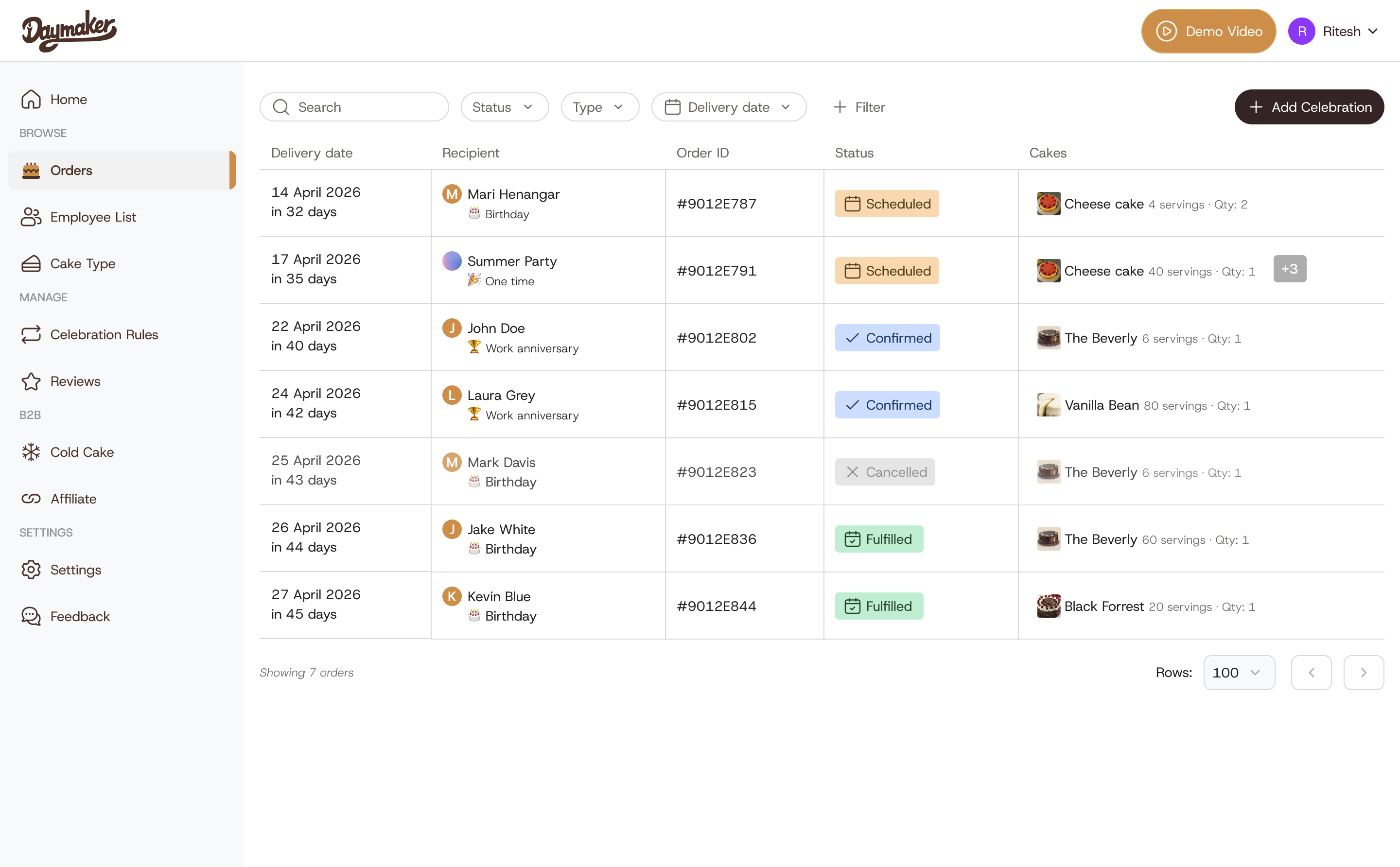
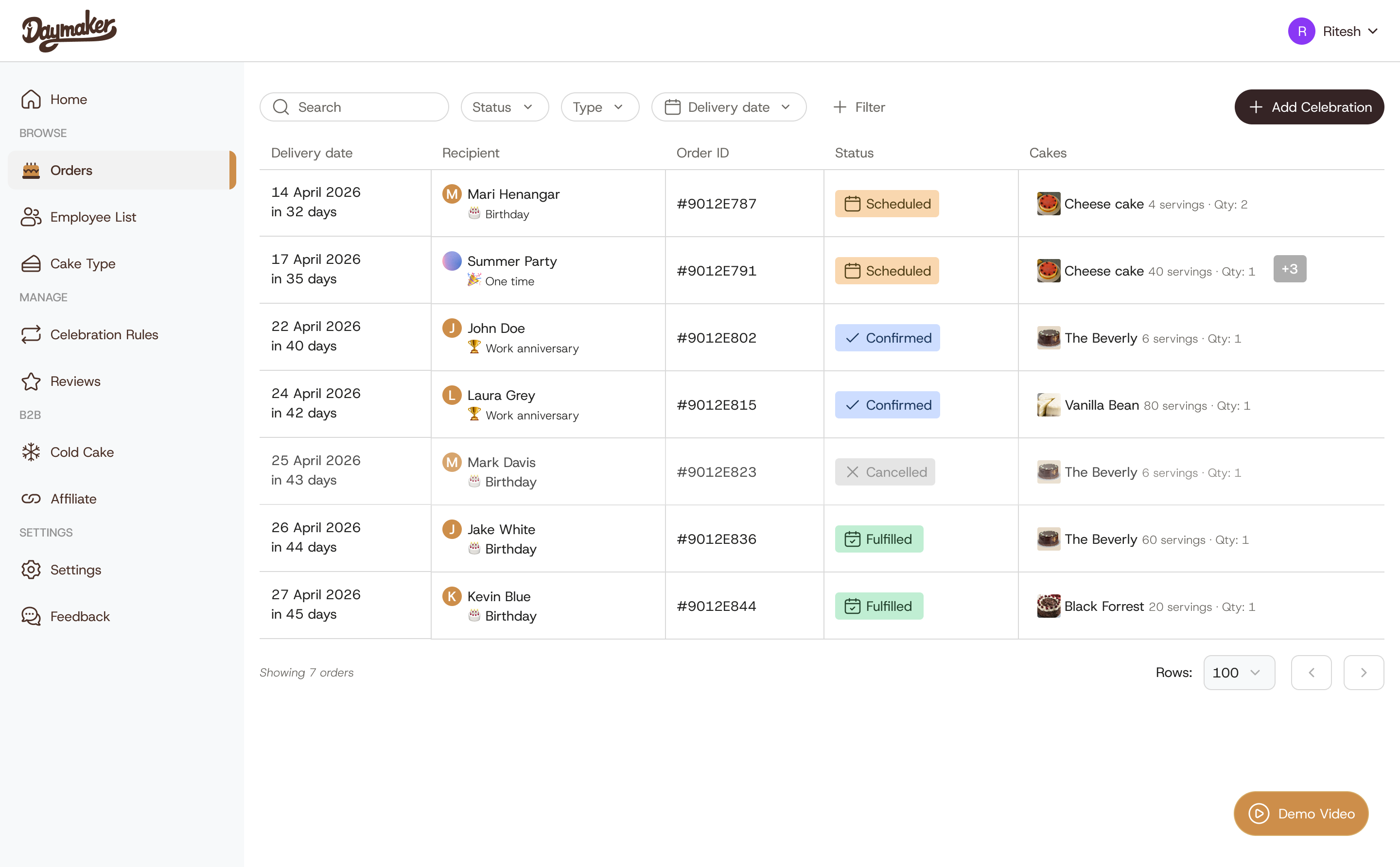
The Lovable build had every feature, spread across panels and pages. The redesign brings them into one table.
Drag the handle to compare.


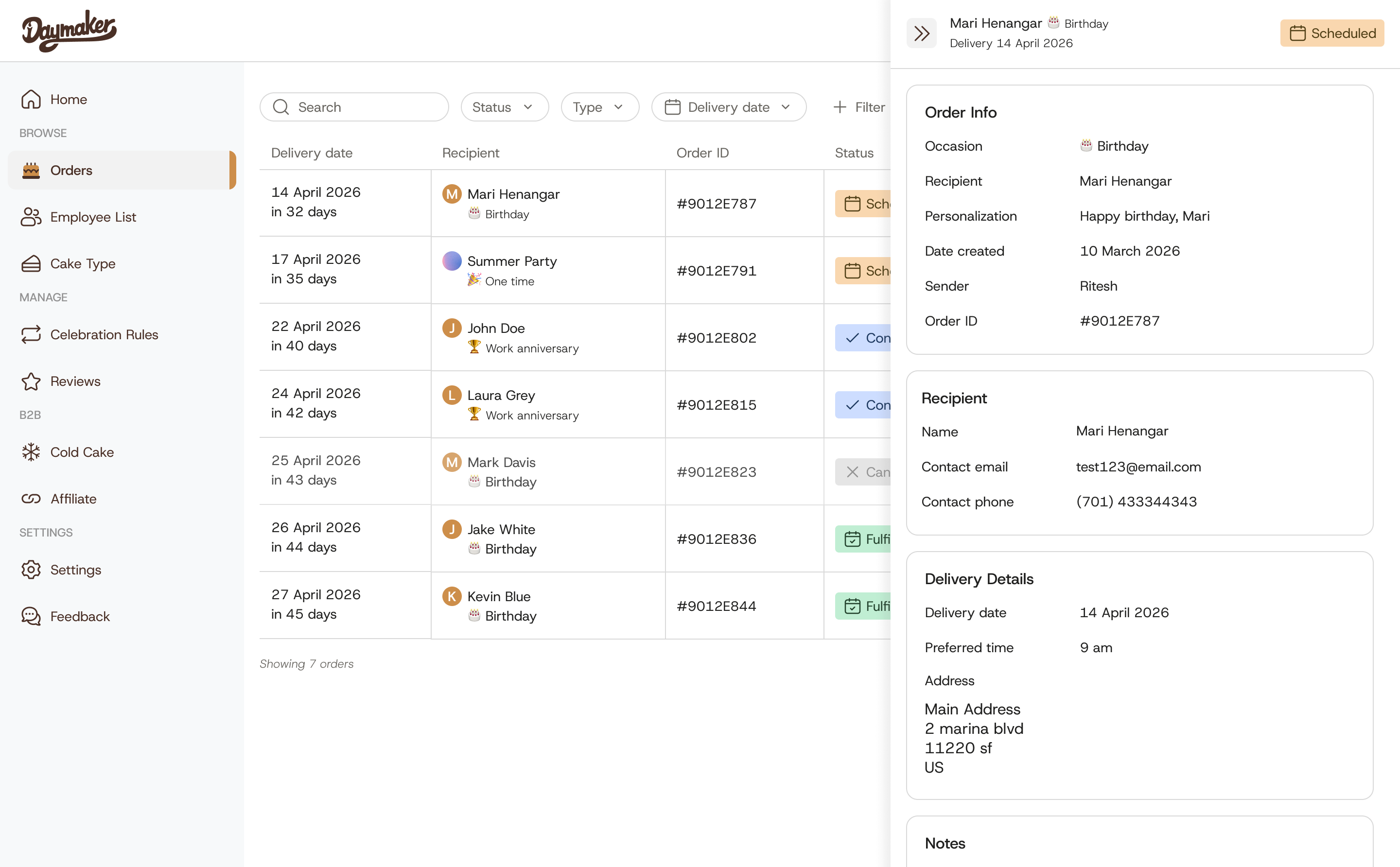
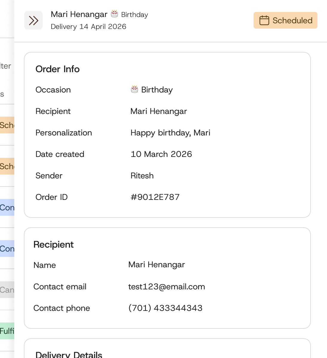
A side panel holds the order info, recipient, delivery details, and notes. The table stays in view behind it.

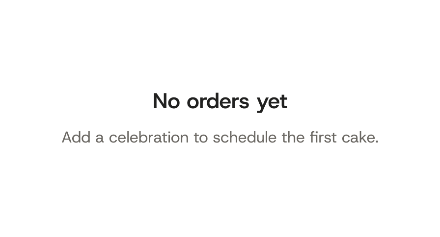
An empty page says so and points to Add Celebration. Cancelling asks first, and Keep order is the safe choice.


The problem
I started by auditing the Lovable version, and found the spots where the page made people read, hunt, or switch pages. Answering one question took three steps, for every cake, every day. Open the filter panel, scan the grey tags, find the pencil icon.

One of the founders, as I remember the conversation.


Editing was the fifth problem. It hid behind a small pencil icon on each row.
Bringing features together
Things that belonged together were spread across the page and the menu. I merged them, so each job has one home.
What changed
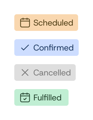
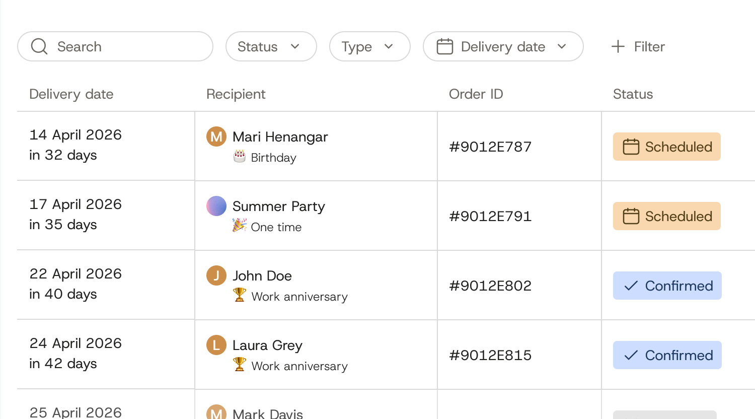
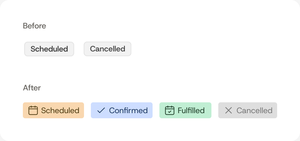
Scheduled, Confirmed, Fulfilled, and Cancelled are easy to tell apart at a glance. Cancelled rows also fade back, so live orders stand out. Each row shows the name and the occasion, and a countdown says how soon the cake is due.


A photo, the servings, and the quantity sit together. When an order has more cakes, a small +3 tag keeps the row short. Hover the tag to see the rest.


Search, Status, Type, and Delivery date sit right above the table. More filters open from + Filter, so the orders show up first. One-time celebrations lost their own page, so a founder who bookmarked it has to filter instead.


The details
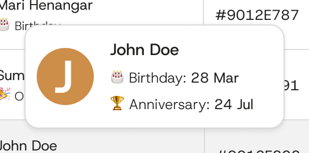
Hover a name and a card shows that person's birthday and work anniversary. Those dates would widen every row. So they live in the card instead. The dates leave the row, so a founder who wants them at a glance has to hover.

Editing moved from the pencil icon into a panel that opens on the right. Order info, recipient, delivery details, and notes sit there. The table stays in view behind it. Editing is two clicks instead of one.

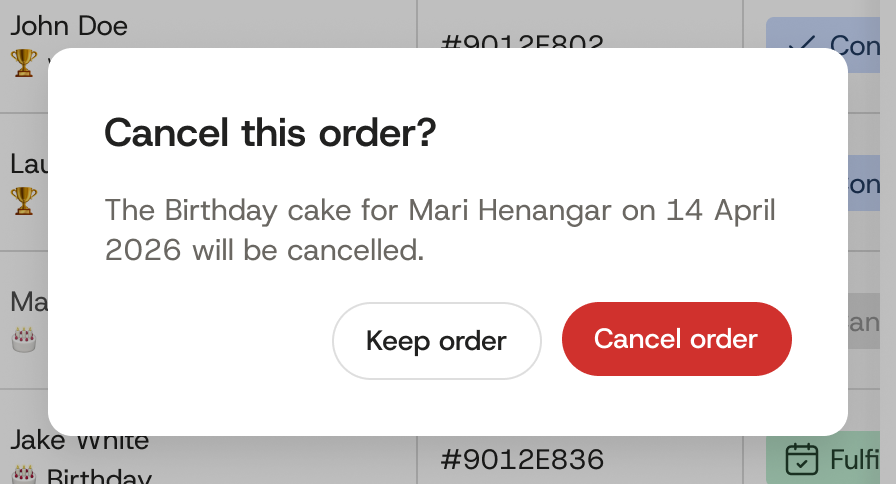
When there are no orders, the page says so and points to Add Celebration. Cancelling an order asks first. The dialog spells out the recipient and the date, and Keep order is the safe choice. Cancelling takes one more click, because the dialog asks first.


One screen has the Demo Video button floating over the corner of the table. The revised screen moves it into the header. It also adds a rows per page control and page arrows under the table. A control most days never need.


What happened
After two weeks, the redesign went to the founders as Figma screens and the working prototype on this page.
Their first reaction was to the status colors and the recipient column, the two things they had been reading around every day.
Two weeks left no time for user sessions. The audit of the Lovable build stood in for research. An audit can show where a page makes you read or hunt. The first thing I would test is whether a founder can find one order, like a birthday cake due next week. Can they do it without a single filter?
Two weeks earlier, checking on one cake took three steps. In the prototype it takes one look.
Prototype
I used Claude to turn my Figma screens into this working prototype. The screens and sample data come from my final design.
Hover any name, filter, or click a row. Press Esc to close.
Next case study